Level 10 Artist of Life - Setting Goals

I don't know who came up with the Level 10 Life but I've seen it everywhere for a long time and when I saw Kara's from BohoBerry, I had to try it, but I knew I wanted to make a few changes. At this time I was getting ready to move into a new Bullet Journal, so I was also getting ready to re-visit some of my Artist of Life (by Lavendaire) spreads. Here is my twist on the two. This spread took two 2-page spreads. I used one for my chart and quick lists for my brainstorm-evaluation of each life area.

I used a circular chart to visually display the areas and my scoring. I didn't do any kind of scientific scoring here, I did what I felt based on my little +/- lists under each area and how much I weighted each item on those lists. When faced with a color coding task...I cannot help myself but use the rainbow. It never even occurred to me to create a one or two color scheme until I saw versions like that on Pinterest. 

The second spread was dedicated to a more specific goals in each area. I always use the SMART method when creating and evaluating goals—Specific, Measurable, Attainable, Realistic, and Time-bound. I required myself to come up with at least three actionable goals under each life area. Some were major, some were sort of "easy wins", but I believe it's important to build or grow into major goals, sometimes that means breaking big goals into little goals.

I thoroughly enjoyed this exercise. I love having a visual to understand something, and to set specific goals, it was really helpful for me to separate them out in the same way I did with the Artist of Life workbook so that I could use all that work I put into the original goal spreads I made in my old bujo. I am a little behind in my mid-year review and update because mid-year I did a lot of traveling and then all of a sudden it's my birthday and I'm turning 30-years old! I will surely update my goals using this method though because I love the categorization and the ease with which I can utilize color and format.


KL Polish Summer Line Review

My goodness, I LOVE the KL Polish line, and this summer line is no exception. Since launching in Fall 2016, Youtuber KathleenLights, has released four seasonal lines and one limited edition special birthday polish. The Summer 2017 line consists of six beautiful, super summery shades. I bought four...as has been my pattern with each of the previous releases. 

Packaging

The KL Polish line features a smooth, easy grip, matte black handle. The bottle itself is squared off, making the base really solid, and less likely to knock over while in use. The brush is flat, with a medium width, which I LOVE. My nails are flat-ish but still have clear C-curve, and this brush is wide enough to limit the number of strokes I have to do to cover the nail, but maneuverable enough to get around the curves of my nail bed. 


*Note. I will only be commenting on the following characteristics for the four colors I purchased from this line.

IMG_4109.jpg

South Peach. This was the color I was honestly most excited about when Kathleen & KL Polish started releasing pictures of the new line. Actually, I think I remember seeing her wearing this color in a video and thinking, "OMG, what is that color? It's gorgeous!" Anyhoo, it's a great color. As with all of her polishes, this is a two coater, although it's similar to the Coconut Milk one in the way that it covers. If you want a full opacity, you'll need three coats. If it were a dark color this would bother me more, but it, like Coconut Milk is really light and not very bright so it looks nice with that almost natural tinted...but not, because it's clearly polished. I tested all of the colors without a base or top coat, and honestly, this color held up the best in terms of longevity. 

IMG_4107.jpg

MIA. This is probably my least favorite color of the ones I bought. It's actually a nice pink, I'm just not a very pink person. It's kind of like an almost metallic Barbie or Lisa Frank kind of pink. It's a two-coater for full opacity, and covers a lot smoother than South Peach. This one took longer to wear down, but even once it did, the chipping is smooth. I would give it an average rating for longevity.

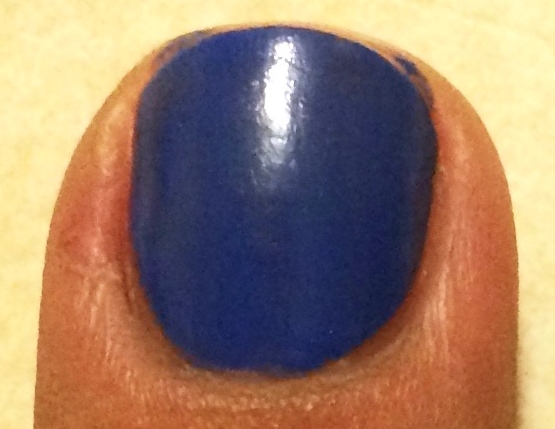
Porter Miami. This blue is GORGEOUS. I was very surprised how much I love this color, I'm not usually the biggest fan of blue polishes. It's a perfect combination of cobalt and indigo. Applied beautifully, super smooth, and I probably could've gotten away with just one coat of this. It wore at the end rather quickly, but it was also on my two most used fingers on my dominant hand. I'm sure with a good base and top coat, this would last fine thought, KL polishes usually do. I'm in the middle of a hunt for good base and top coats, so that would've been too many variables to juggle. Overall, I love this color.

Ocean Drive. This one was the biggest surprise of the bunch. I'm not usually one for sparkly polishes, and am picky about what kinds of greens I like to wear. But this one...ooooo baby! It took my breath away with the first stroke! It covers well in one coat, but with two coats you get a LOT of dimension that really highlights the oceany-mermaidy vibes that you see in the official pictures. My lighting is a little off so you don't get the full effect here, but let me just say, this is my favorite of the collection. The longevity of this one was actually right up there with South Peach, in a tie at first place in the collection.

Overall, like I said, I love this collection. I was happy to be surprised at how my expectations were basically flipped on which colors I loved the most. I'm so happy to add them to my gorgeous Color Clutch polish organizers on my sweet little art shelf I just set-up. Let me know in the comments what nail polishes you're rocking recently.